Young Arctic

This project became a real turning point for me. At the time, I was a junior designer at an agency that focused on digital products. I usually worked on redesigns and smaller tasks, but one day we won a government tender from the Murmansk region, and I was trusted to design everything from scratch. It was more than just an interface. I was responsible for the logic, visuals, structure and interactions.

Duration: Jul 2022 – Apr 2023 (10 mos)

Duration: Jul 2022 – Apr 2023 (10 mos)

Duration: Jul 2022 – Apr 2023 (10 mos)

My Role: Middle UX/UI Designer

Platforms: Web, Mobile
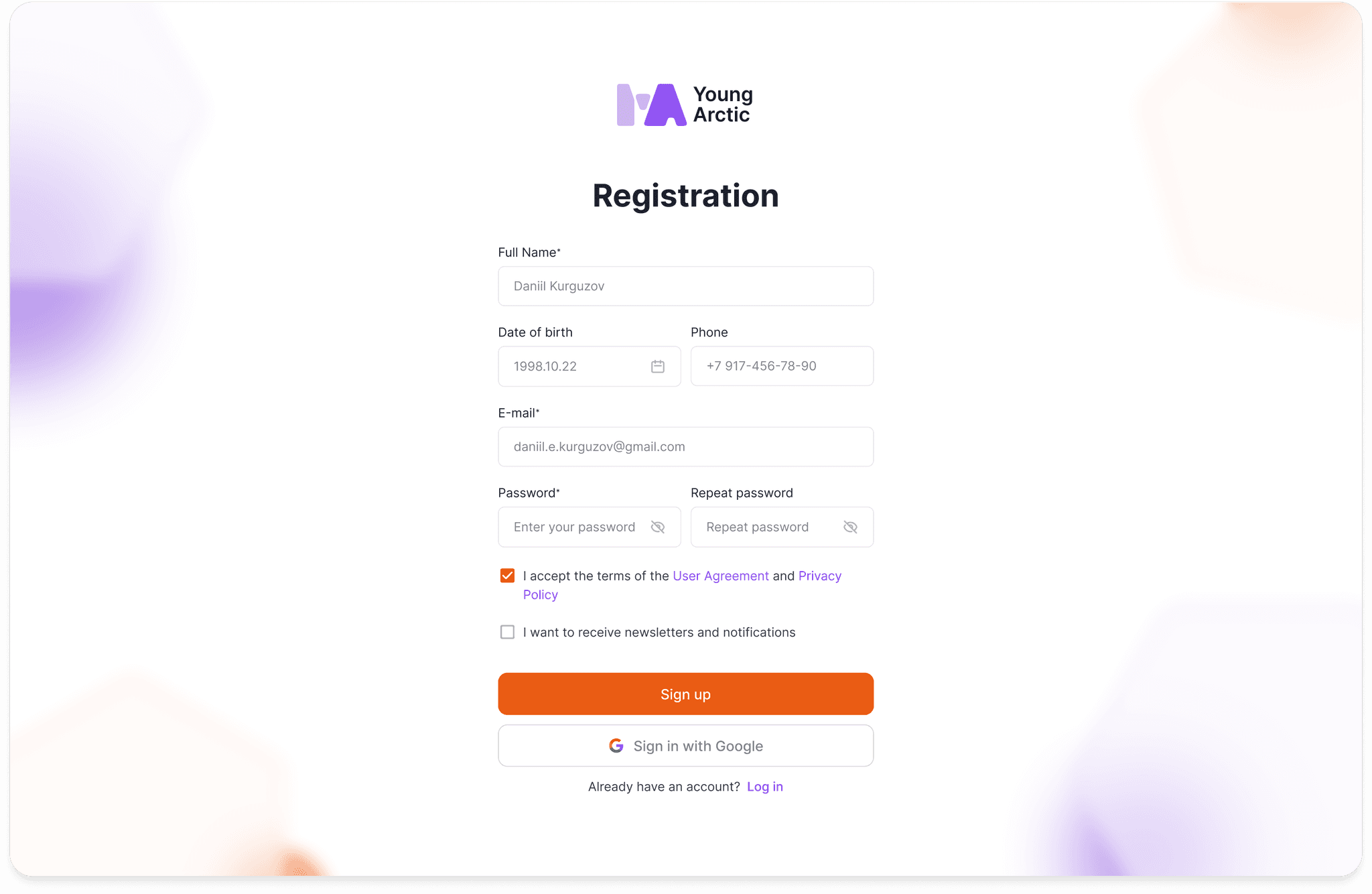
Registration screen

Goal

"Young Arctic" is a platform created to engage young people in the region’s social, cultural and economic life. It included a web portal and a mobile app. The main goal was to make information about opportunities, support and direct contact with local authorities easy to access.

My Role

I was the only designer on the project and coordinated everything related to visuals and logic:

  • Mapped out the platform’s features;

  • Designed the interfaces for both web and mobile;

  • Built a large-scale design system and UI Kit;

  • Worked closely with the mobile developer;

  • Took part in testing and supported the project through to release.

Problems

The client came in with three key problems:

📁

📁

📁

Young people in the region don’t have a single source of information about jobs, grants and events.

📵

📵

📵

There are no convenient tools for communication between young people and local authorities.

🤯

🤯

🤯

There is no simple and clear way to apply for grants or request support.

Process

I started with a feature map that showed what the platform would include and how the sections and user flows were connected. Once the structure was approved, I moved on to designing the interfaces.
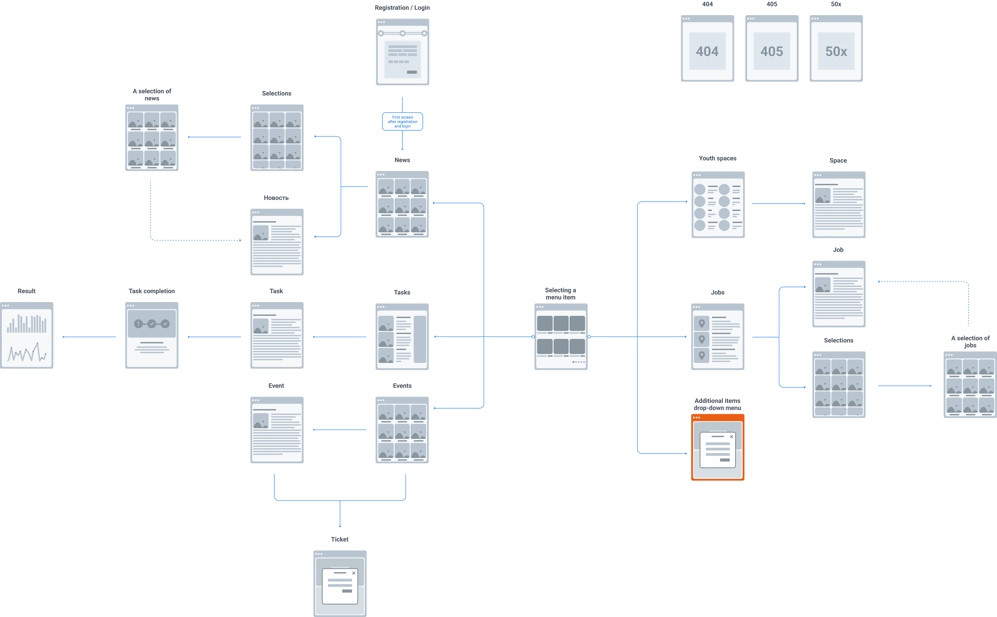
Feature map

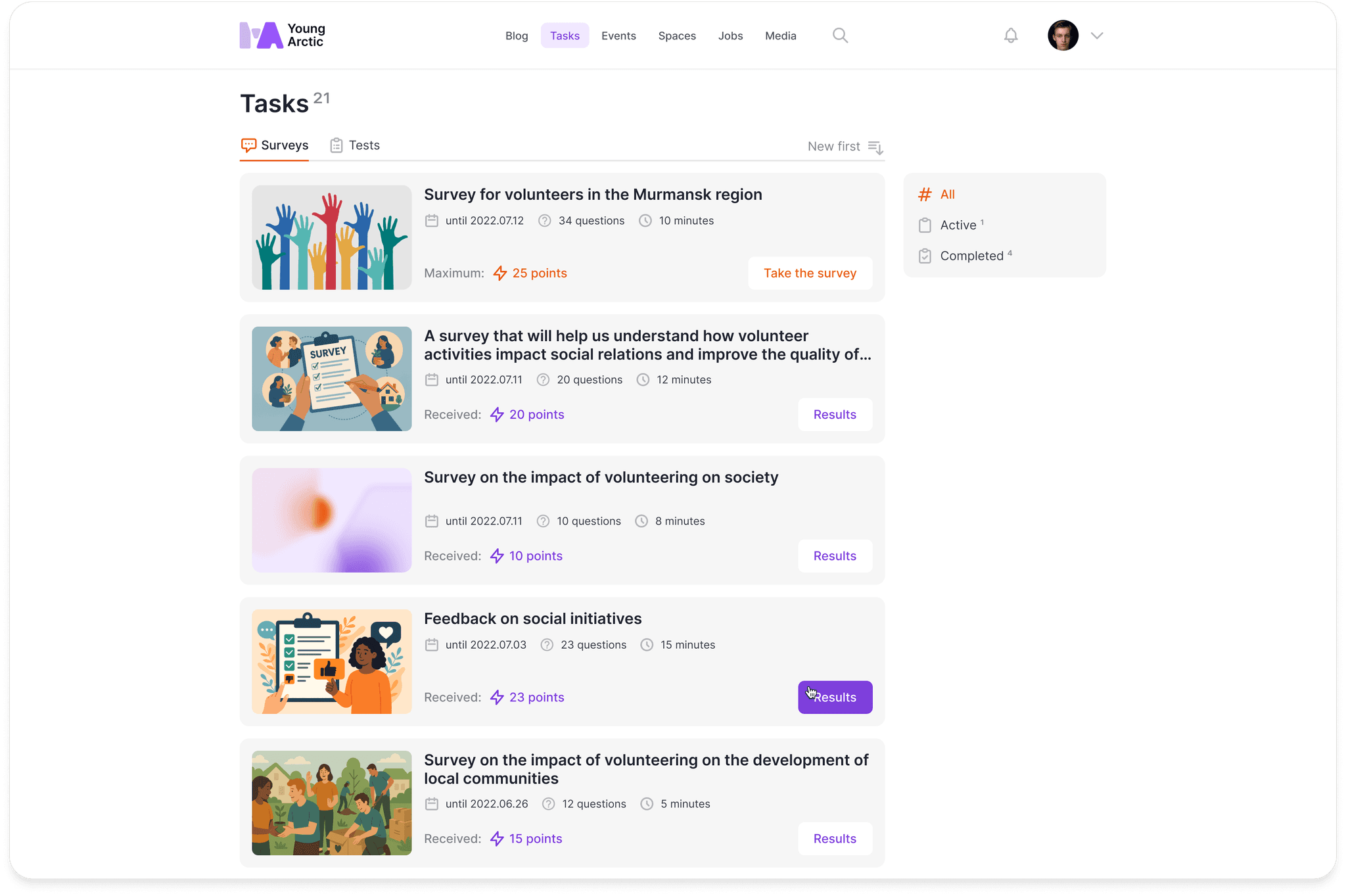
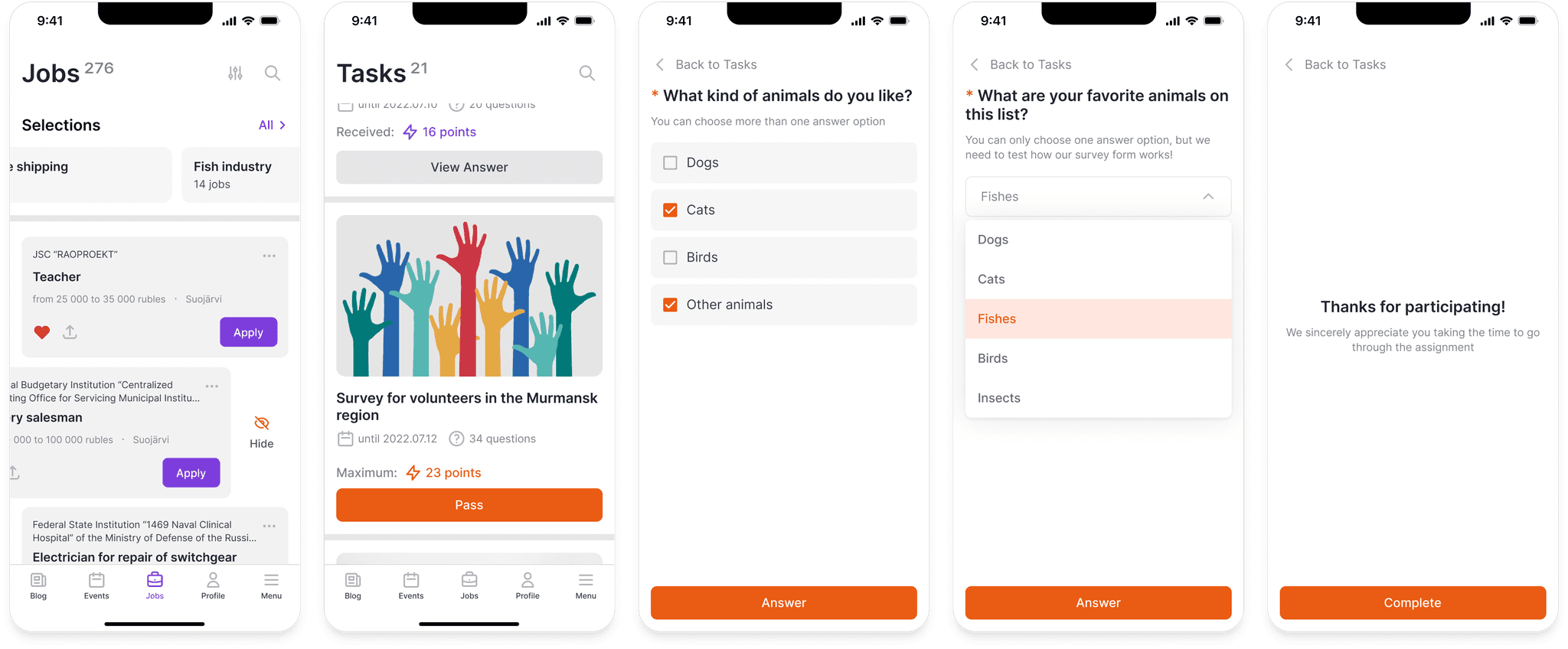
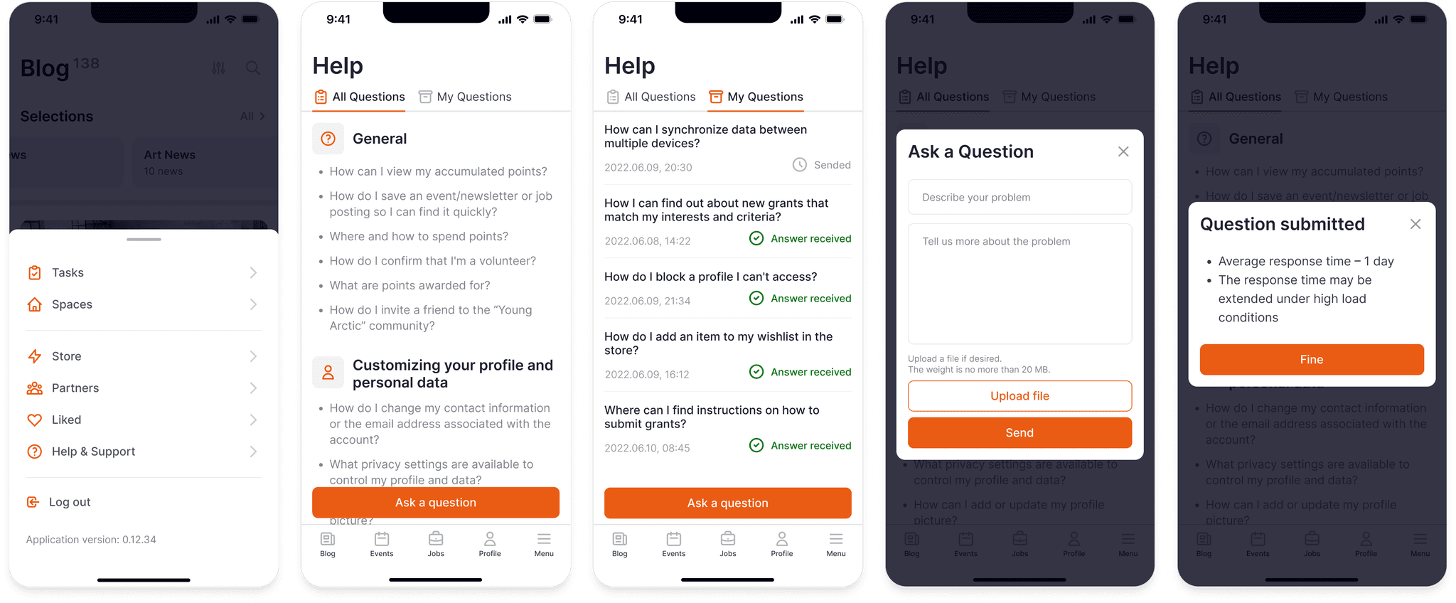
The project turned out to be large in scale. I designed all the states, transitions, error messages, filters and interactions. It was important not just to draw pages but to build a living system. I focused on logic, a consistent visual language and predictable user behavior.
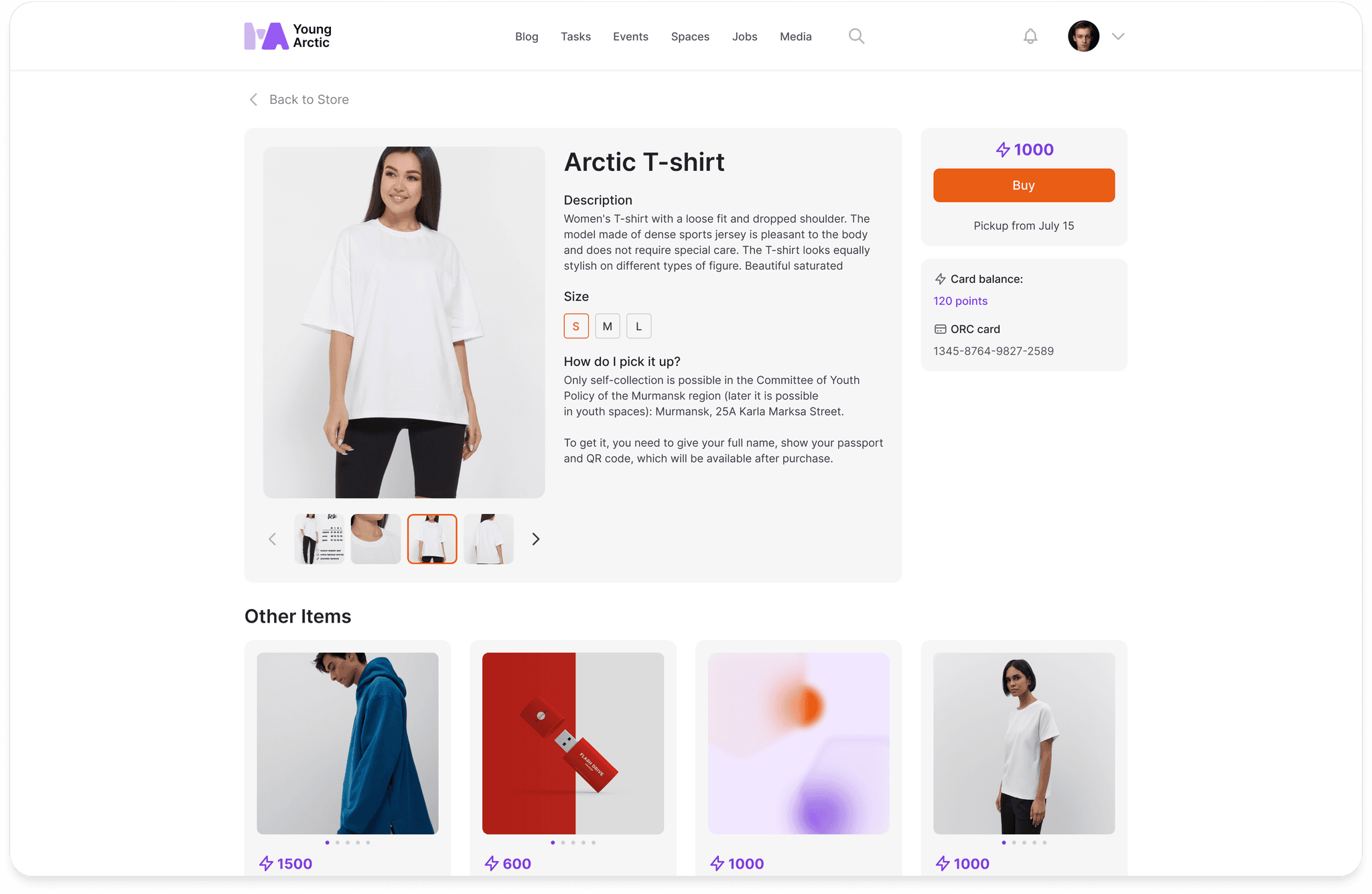
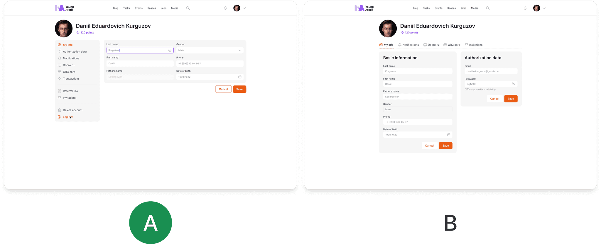
Web version screens

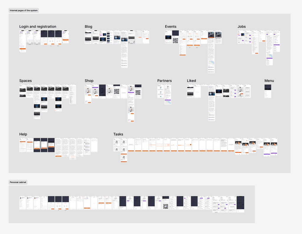
Mobile version screens

I created a full UI Kit, from colors and icons to cards and tables. Every component had clear descriptions for states, behavior and responsiveness. This sped up development and ensured a consistent style across both web and mobile versions.

UI Kit

Key Features

In the platform, I aimed to bring together all the sections that matched the client’s needs:

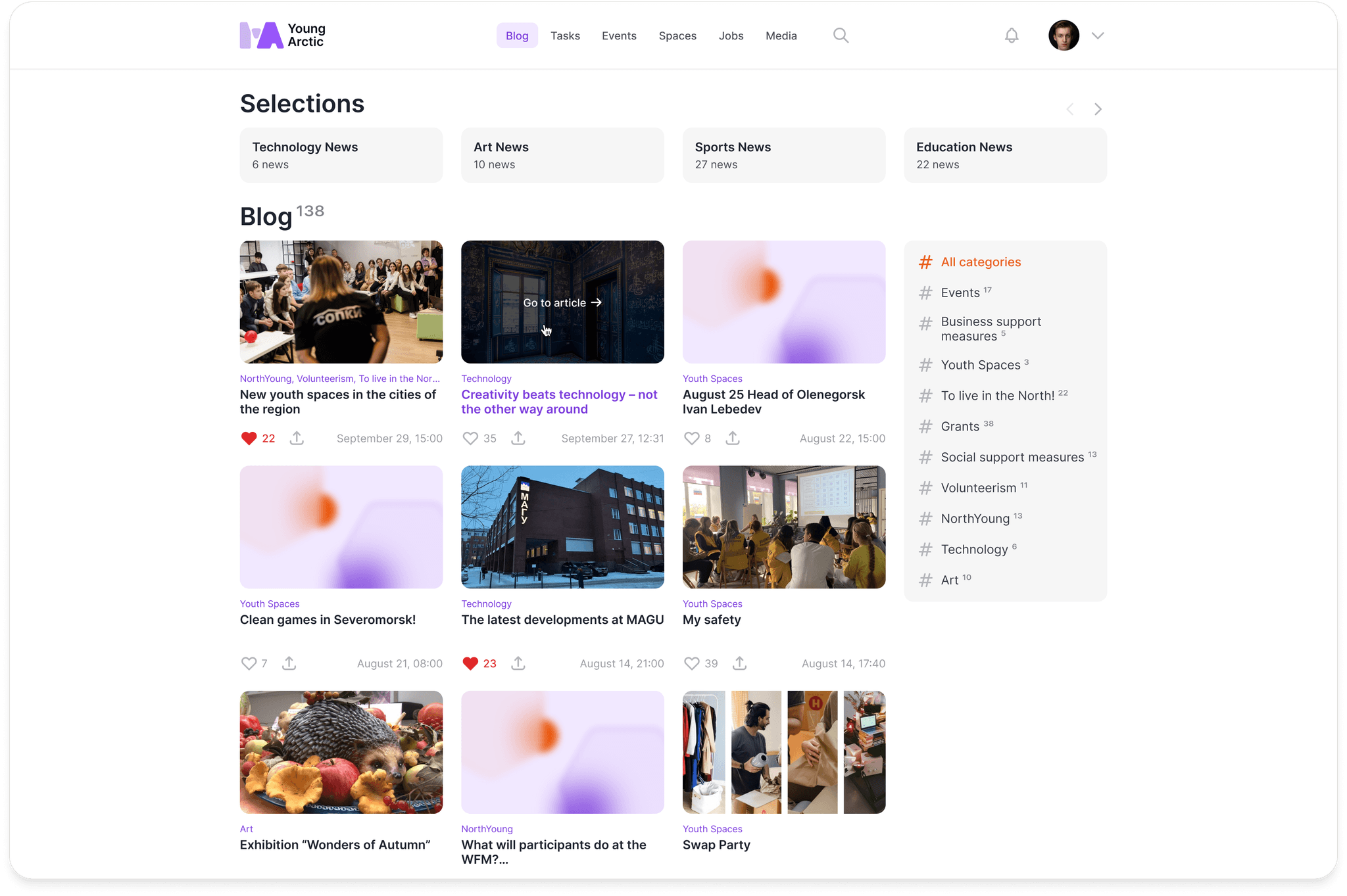
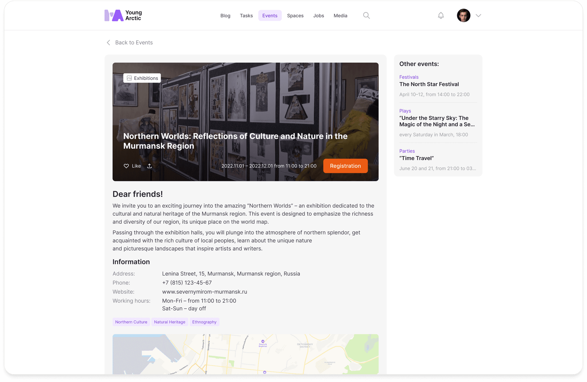
News and blog is the section for current updates in the region. I made it feel lively and user-friendly. Content is grouped by topic, and the cards with previews, reactions and dates create a sense of activity. The tag cloud helps users quickly find what they need. All of this keeps young people engaged and makes reading the news feel like a natural habit.

The mobile version is just as user-friendly as the web one. I kept all the key features, including collections, filters, fullscreen view and smooth navigation through the bottom menu. The interface is light and easy to use.

The mobile version is just as user-friendly as the web one. I kept all the key features, including collections, filters, fullscreen view and smooth navigation through the bottom menu. The interface is light and easy to use.

Tasks and surveys help engage young people through gamification. Each one is designed as a card with points that can be exchanged for rewards. I added tabs and filters to make navigation easy.

Tasks and surveys help engage young people through gamification. Each one is designed as a card with points that can be exchanged for rewards. I added tabs and filters to make navigation easy.

The job catalog shows current openings, including volunteer opportunities. I added filters for city, salary and work format, and the cards include all the key details. There is a quick apply option and the ability to hide listings you’re not interested in.

The job catalog shows current openings, including volunteer opportunities. I added filters for city, salary and work format, and the cards include all the key details. There is a quick apply option and the ability to hide listings you’re not interested in.

Mobile interfaces for jobs and surveys are adapted for quick actions. Large tap areas, clear statuses and simple navigation make the experience smooth and easy.

Mobile interfaces for jobs and surveys are adapted for quick actions. Large tap areas, clear statuses and simple navigation make the experience smooth and easy.

The events section lets users sign up for upcoming activities. Each event includes a description, date, format, registration, address and tags. Nearby, users see suggestions for similar events. This helps them discover new things and stay engaged.

The events section lets users sign up for upcoming activities. Each event includes a description, date, format, registration, address and tags. Nearby, users see suggestions for similar events. This helps them discover new things and stay engaged.

The grants and subsidies section makes it easier to apply. The process is broken into steps, with a city search and a user-friendly budget form. The interface is simple and clear, even for first-time users.

The grants and subsidies section makes it easier to apply. The process is broken into steps, with a city search and a user-friendly budget form. The interface is simple and clear, even for first-time users.

Help and feedback make it easy to get answers or ask questions. The questions are grouped by topic, and the contact form is always accessible. This keeps the service clear and builds trust.

Help and feedback make it easy to get answers or ask questions. The questions are grouped by topic, and the contact form is always accessible. This keeps the service clear and builds trust.

The mobile help section keeps all the same features. There is quick search, a tab for submitted requests and an easy-to-use form with tips and attachments. Users understand what to do and when to expect a reply, which builds even more trust.

The mobile help section keeps all the same features. There is quick search, a tab for submitted requests and an easy-to-use form with tips and attachments. Users understand what to do and when to expect a reply, which builds even more trust.

In the store, users can exchange points for merchandise. Points are earned through tests, surveys and volunteering, which encourages participation and makes the experience more fun.

In the store, users can exchange points for merchandise. Points are earned through tests, surveys and volunteering, which encourages participation and makes the experience more fun.

A full admin panel was developed. It allows real-time tracking of user activity, content management and request moderation.

A full admin panel was developed. It allows real-time tracking of user activity, content management and request moderation.

User management

Jobs selection editing

User request handling

The interface needed to be both modern and simple, so it could work for a wide audience. We didn’t have access to analytics, so I built A/B tests directly into the platform’s surveys. Users chose between interface options and earned points for participating. This allowed us to:

The interface needed to be both modern and simple, so it could work for a wide audience. We didn’t have access to analytics, so I built A/B tests directly into the platform’s surveys. Users chose between interface options and earned points for participating. This allowed us to:

  • Collect data;

  • Engage users;

  • Boost motivation through gamification.

Results

Six months after the release:

  • Around 14% of the region’s population under 35 registered;

  • 1867 blog posts published;

  • 31,000 job listings posted;

  • 4300 volunteer positions filled;

  • 1400 events announced;

  • 88 grant applications submitted, many of them approved;

  • 33,000 visits to youth centers.

The main result: Murmansk Region ranked third in the country for youth policy implementation among regions with a population under 1 million. This proved that thoughtful UX can have a real impact on social processes.

The main result: Murmansk Region ranked third in the country for youth policy implementation among regions with a population under 1 million. This proved that thoughtful UX can have a real impact on social processes.

  • Designed a large-scale platform from scratch for the first time;

  • Learned to work under high responsibility and with a government client;

  • Gained experience in building architecture, thinking in systems and planning for scale;

  • Realized the value of UX not as a trend but as a way to care for people;

  • Felt for the first time how design can truly change people’s lives.

The "Young Arctic" project marked my professional shift from a junior to a middle-level designer who can build complex systems. It wasn’t a business product. It was a socially important platform where I saw the real power of UX design for the first time. I’m proud to have been part of it.